Some of the links in this article are affiliate links. This means that I may get paid a small commission if you click on the link and make a qualifying purchase. There is no additional cost to you and the small commission I earn helps support my blog.
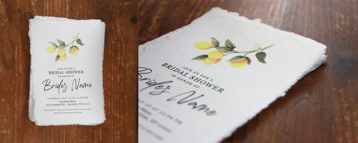
Earlier this year, I was tasked with handling the invitations for my soon-to-be sister-in-law's bridal shower. The vibe was classy and rustic at a cute local winery, decorated with a theme of lemons and florals. The bridesmaids had been scouring Pinterest for weeks building our inspiration board. Tasks were broken down and assigned to different people. I gladly volunteered to make the invitations, among other things.
We had a few inspiration pictures, but this one was by far the most appealing, mostly due to the paper choice:
This style of paper is known as deckle edge, which is essentially when the paper is torn instead of cut, leaving a natural and rustic edge along all sides. Deckle edged paper is available at some invitation printing services online, but it does come with a higher price tag. This technique is also doable as a DIY, but it requires the right type of paper and a bit of patience. Typically, watercolor paper is used with a ruler, or special deckle edge ruler, and torn along the edge. Depending on the paper type and tool, variations in jaggedness and softness can be achieved.
For this project, I decided to buy deckle edge paper and DIY the design and printing.
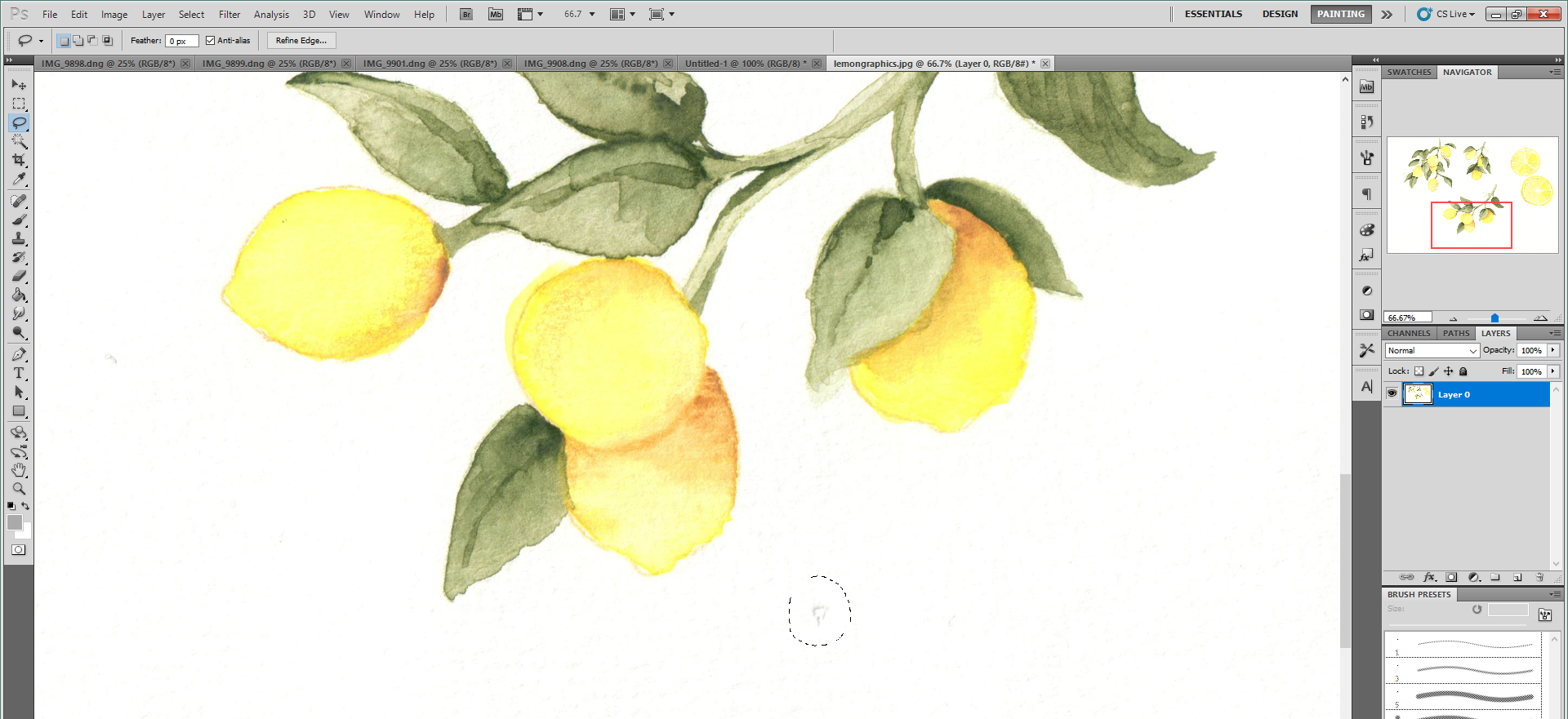
I started by creating some lemon graphics. I was really looking forward to pulling out my watercolors which I haven't touched in probably at least a year. As a busy mom, it's not often that I have the time to sit down and paint, so despite having an AI image generator available to me, I decided to go the traditional route and do it by hand.
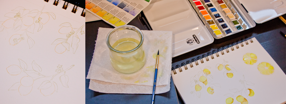
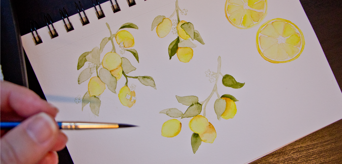
Per my usual process, I took my graphics and scanned them into my computer to touch up. This process involves removing the white background, color correcting, and removing dust and lint specks.
Using these graphics, I came up with a few designs that I liked, but then remembered that it would be impossible to print all the way to the edge of the paper. Generally printers have a 1/4" perimeter that isn't able to be printed on due to how the paper moves internally. Print shops get around this by printing the design on a larger piece of paper, then trimming down the design to the printed edge, often including a bleed to make sure slight variations in cuts don't leave a white edge. This is something that I have done on past projects as well.
In our situation, there is no option of printing bigger and cutting it down because the paper is already the desired size. Trimming to size would also remove the deckle edge detail that we specifically bought. Therefore, I made sure the finished design would not get too close to any edges of the paper.
One design rule-of-thumb that I always need to remind myself while reviewing is not mixing serif and sans-serif fonts. While sometimes breaking the rule is totally valid, generally speaking, designs look more cohesive and professional when not mixed. I tend to forget this on my initial designs then go back in and need to update it in the final updates.

Once the design was finished, I was able to easily print these on my home printer. There were one or two pieces of paper that got a jammed because the edges were a bit too uneven, but overall I didn't run into any issues and the end result turned out beautifully! I'm glad I was able to bring the vision for these invites to life!